Cadbury GEN AI campaign

//TIMELINE// ⏰
February 2024 - June 2024 (5 months)
//SCOPE// 📝
User Experience Design
User Interface Design
eDM Design
//MY ROLE// 🙋♂️
UX Lead - Experience Designer
//TEAM// 👨👩👧👦
Thomas White - Experience Designer
Claudia Buda - Digital Project Manager
Keith Magnus - Senior Digital Designer
Nick Robinson - Creative Technologist
Linh Diep - Account Director
//Project Overview//
In the growing landscape of AI 🤖, it's up to brands to think about the best ways to utilise it, while staying true to their core identity. Not only that, but how can they create experiences that use AI to deliver value to customers, whilst getting value in return in the form of customer data? That was the challenge presented to us by Cadbury.
"How might we utilise AI in an engaging way to drive value exchange between Cadbury and its customers?"
In comes generative art! 🖼️ Keeping in mind Cadbury's brand and their values, we thought about what might be the most interesting and fresh way to deliver AI to customers without coming off as tacky and inauthentic.

//Setting the stage//
The digital team were handed a creative task brief done up by the Creative team to design the experience for value exchange.


The goal?
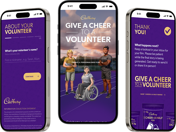
To create custom videos using AI generated characters, based on inputs by the user. Participants input volunteer information into the form, including their name, body type, physical ability, and volunteering roles, into the form. The AI generates a 2 minute video with that volunteer as the main character!
The videos are designed to be shared, so we want to ensure that we make an attractive experience that users feel proud to take part in and share with those close to them.
The purpose?
To celebrate volunteers of grassroots sports! To give back to a community of people who spend their time giving to the community. We want volunteers to feel acknowledged for their contribution and to receive something special from Cadbury.
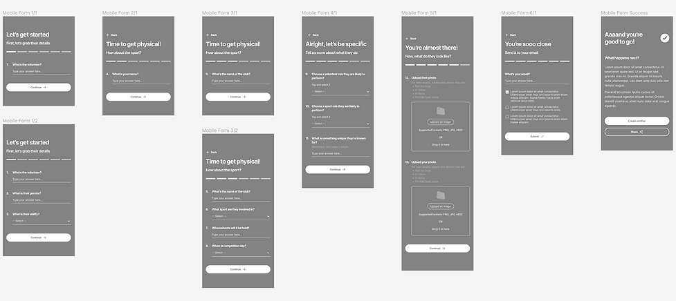
//Wireframes//

//Behavioural principles//
To ensure our form is effective for maximum user engagement and success, here are some of the behavioural science principles we implemented.
Goal Gradient Effect
We tend to work harder and faster to achieve our goal the closer we are to reaching it.
It is important to give users a clear overview of what is expected from them, especially when completing tasks that require effort from them. Providing a clear indication of progress helps to motivate users to complete the task, and giving artificial progress towards the goal will ensure users are more likely to have motivation to complete the task.
Chunking
Users tend to process information when it’s broken up into smaller ‘chunks’ that clearly relate to each other.
We have broken the form down into bite sized sections where the questions contextually relate to each other. This will ensure that users don’t feel overwhelmed by the amount of questions being asked of them and makes the form feel more accessible and palatable.
Endowed Progress Effect
Users are more likely to work harder to complete a task if they are given the illusion of a head start.
Allow for fields to be pre-populated based off existing user data. This could include names or email details. This ensures that we give users the perception of a good head start, as well as an easier sense of progress.

//Some things to note//
Storytelling
My aim was to use the landing page to tell the story of the Cheer and a Half campaign and what Cadbury is doing on a micro level with this activation, and on a macro level with their TV spots and product packs.
Page navigation
I included a top CTA so that users can give users the freedom to navigate the page as they want. Especially considering if we have repeat users, we want them to be able to skip down straight to the experience without needing to scroll through the page again.
Considering this is an experience that people are likely to engage with more than once, this is a tick towards usability.

Form animations
I wanted to ensure that we keep users engaged as they fill out the form by introducing bespoke animations and interactions. These animations are designed to delight users by surprising them with new ways of interacting with common form field types like drop downs and lists.
Mobile first
I designed with mobile first, as a majority of paid traffic to the site will be through social channels and YouTube.

//Final designs//
Once approved, I began assisting the UI designer with applying the Cadbury branding to the wireframes, adding in their signature colours and familiar styling to ensure consistency with the rest of the brand.

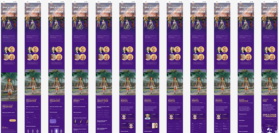
Landing page

Form walkthrough

//Email sharing//
Once the designs were done, we had to think more about how users were going to receive their video, and how they'd share it with the volunteers.
We were aware of the privacy issues of users sharing volunteer contact details without their consent, so we had to find a work around that still maintained a solid user experience.
Our solution
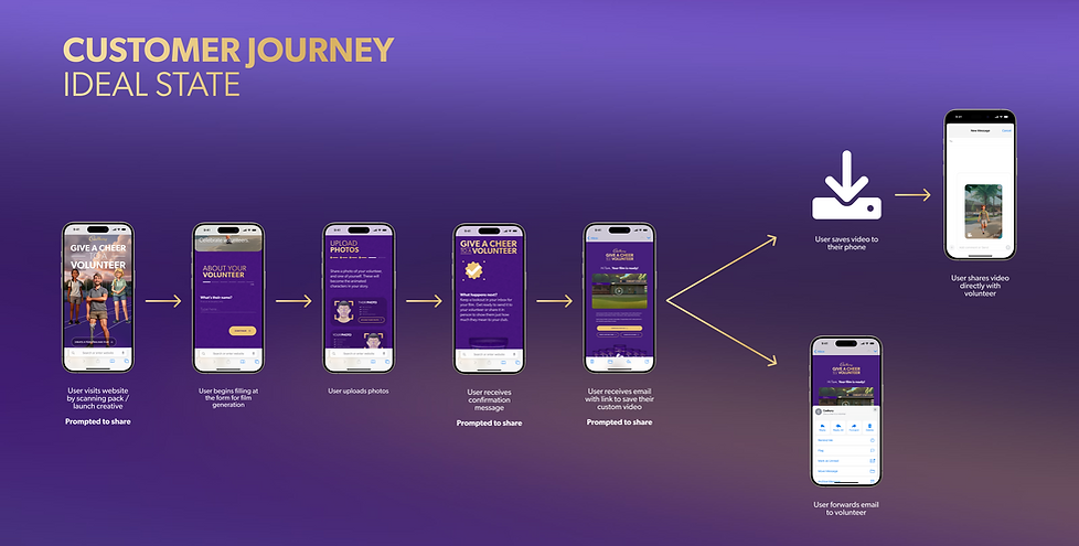
When the user has completed their form, they receive a confirmation message to let them know that their form has submitted. Within the next 24 hours, the user will then receive an email letting them know that their video is ready for download. The user can then either forward that email on to the volunteer, or they can download the video and share through text or socials.
Although that does require extra action on the part of the user, we believe the trade off is worth it.
Below you can see the ideal state of the customer journey.

//Outcome//
When we presented final designs back to the client, it's safe to say they were impressed.
They said and I quote, "This is the level of thinking we expect to see going forward. We've never been shown the full breakdown of why certain decisions have been made and the psychological considerations. That was so great to see!"
We've set the gold standard, so it's up to us to maintain that level of quality for all future Cadbury and Mondelez projects 💫


//Wanna read more?//

